Intro Text Contrast — Response to Feedback
YVV Form · Accessibility analysis & fix · 2026-05-13
Mchael Poncardas (m@poncardas.com)
TL;DR
The feedback was valid and has been addressed. The intro text
technically met WCAG AA contrast requirements (7.07:1 ratio
vs. the 4.5:1 minimum), but it felt grey and hard to
read because of how human perception works — not because of a
standards violation. The subtitle and description have been changed
from text-muted-foreground to
text-foreground/80, raising the contrast from 7.07:1 to
9.95:1 while keeping a clear visual hierarchy under the dark title.
1. The Measured Contrast Ratios
The exact contrast ratios for the intro step text were calculated using the project's OKLCH color tokens and the WCAG 2.2 relative luminance formula.
| Element | Color | On background | Ratio | WCAG AA |
|---|---|---|---|---|
| Title ("Yhdessä Vihaa Vastaan") | #05150e | #fcfafb | 18.03:1 | PASS |
| Subtitle & description | #475a51 | #fcfafb | 7.07:1 | PASS |
| Subtitle & description | #475a51 | Card (white) | 7.33:1 | PASS |
The WCAG 2.2 AA minimum for normal-sized text (below 18pt / 14pt bold) is 4.5:1. At 7.07:1, the old color technically passed — nearly 60% above the threshold. So why did it look grey?
2. Why "Passes" ≠ "Looks Good"
WCAG measures the minimum boundary for readability. It doesn't account for how the eye perceives contrast relative to nearby elements. Three factors made the text feel grey despite passing:
a) Luminance contrast in the heading
The h1 title sits at 18.03:1 contrast — extremely dark. The subtitle right below it drops to 7.07:1. The human eye adapts to the dark title and then perceives the lighter subtitle as washed out, even though 7:1 is objectively legible in isolation. This is a well-documented perceptual effect called simultaneous contrast.
b) Desaturated teal reads as grey
The color #475a51 is technically a low-saturation teal,
but on many screens — especially laptops with poor color accuracy, or
in bright ambient light (common in Finland in summer) — it reads as
plain grey. WCAG measures luminance, not chroma, so it can't
distinguish "grey that passes" from "colored that passes."
c) "Muted" signals unimportance
In UI design systems, the muted-foreground token is
typically reserved for timestamps, labels, helper text, and secondary
metadata — content the user can safely skip. Using it for the
primary onboarding text ("This questionnaire is part
of the Together Against Hate campaign…") signals "this isn't
important," which is the wrong message for the first thing a user
reads.
3. What Was Changed
text-muted-foreground was replaced with
text-foreground/80 on the intro subtitle and description.
This uses the same base color as the title (--foreground)
but at 80% opacity, creating a clear but subtle hierarchy:
| Before | After | |
|---|---|---|
| Title | text-foreground (18.03:1) |
text-foreground (18.03:1)
unchanged
|
| Subtitle | text-muted-foreground (7.07:1) |
text-foreground/80 (9.95:1)
+41%
|
| Description | text-muted-foreground (7.07:1) |
text-foreground/80 (9.95:1)
+41%
|
The contrast improved from 7.07:1 to 9.95:1 — well above the 4.5:1 minimum and now firmly in the AAA range (7:1). The subtitle is still visually lighter than the title, maintaining hierarchy, but it no longer reads as grey.
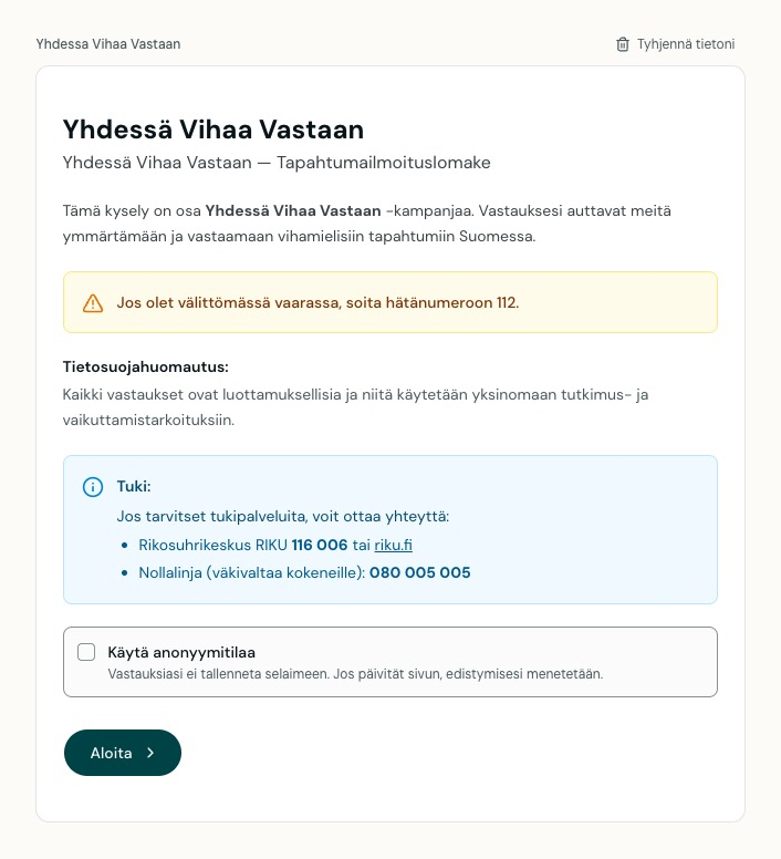
4. Visual Comparison
Before — subtitle uses
text-muted-foreground (#475a51)
After — subtitle uses
text-foreground/80 (composite ~#343f38)
Note: The difference is subtle in this demo. On a calibrated monitor the old color may look fine; on a typical laptop screen or in bright ambient light the improvement is more noticeable.
5. Key Takeaway
- WCAG passing ≠ good readability. The 4.5:1 minimum is a floor, not a target. Text that passes can still look grey, especially next to very dark elements.
- Perceived contrast is contextual. The eye doesn't measure absolute luminance — it compares to surroundings. A 7:1 ratio looks fine in isolation but washed out next to an 18:1 title.
-
Semantic color tokens matter.
muted-foregroundis for secondary content. Primary onboarding text deserves a foreground-derived color. - Real-user feedback > automated tests. No linter flagged this. The feedback was the signal that mattered.